Counting tree rings
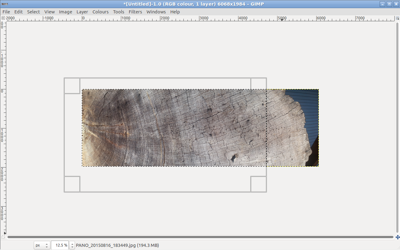
I saw this cross-section of a tree in La Connor, WA. Unusually, perhaps, for such a large tree, there was no nearby sign telling how old it was. Curious, I thought of a couple of ways to quickly get data so I could figure it out later.

#Image Analysis
The Google Camera app has a Panorama setting, which allowed me to get the above photo. So now it's possible for me to count the rings one by one, but that's boring, and isn't an easily repeatable solution.
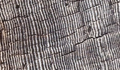
If we look closer, though, each ring of the tree forms a convenient little ridge. At this lighting angle, they leave little shadows. We can work with this.
So I pulled out GIMP, cropped the image so that it included only the right-hand side of the tree, and fiddled with the Levels and Threshold settings to come up with a couple of black-and-white images.
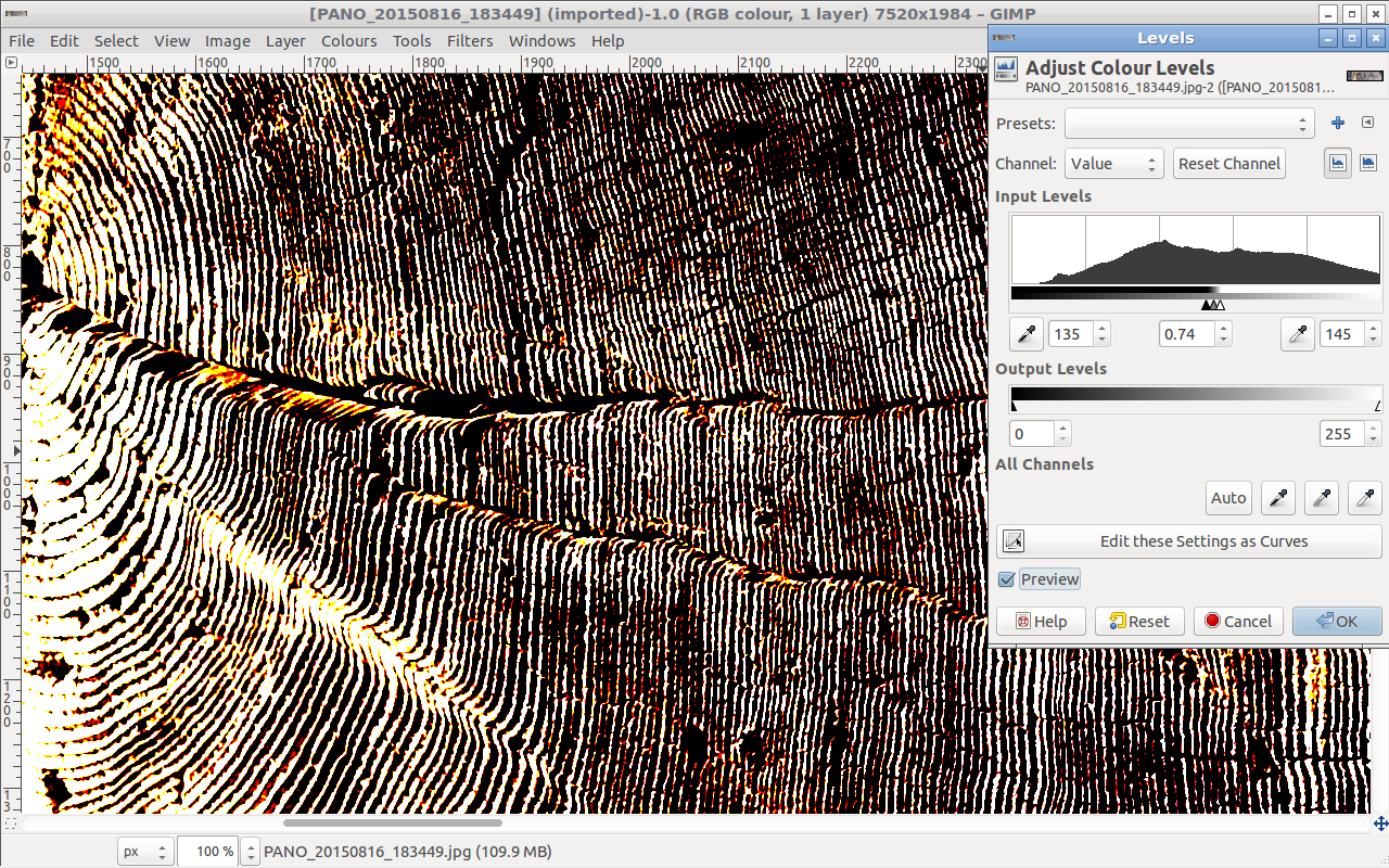
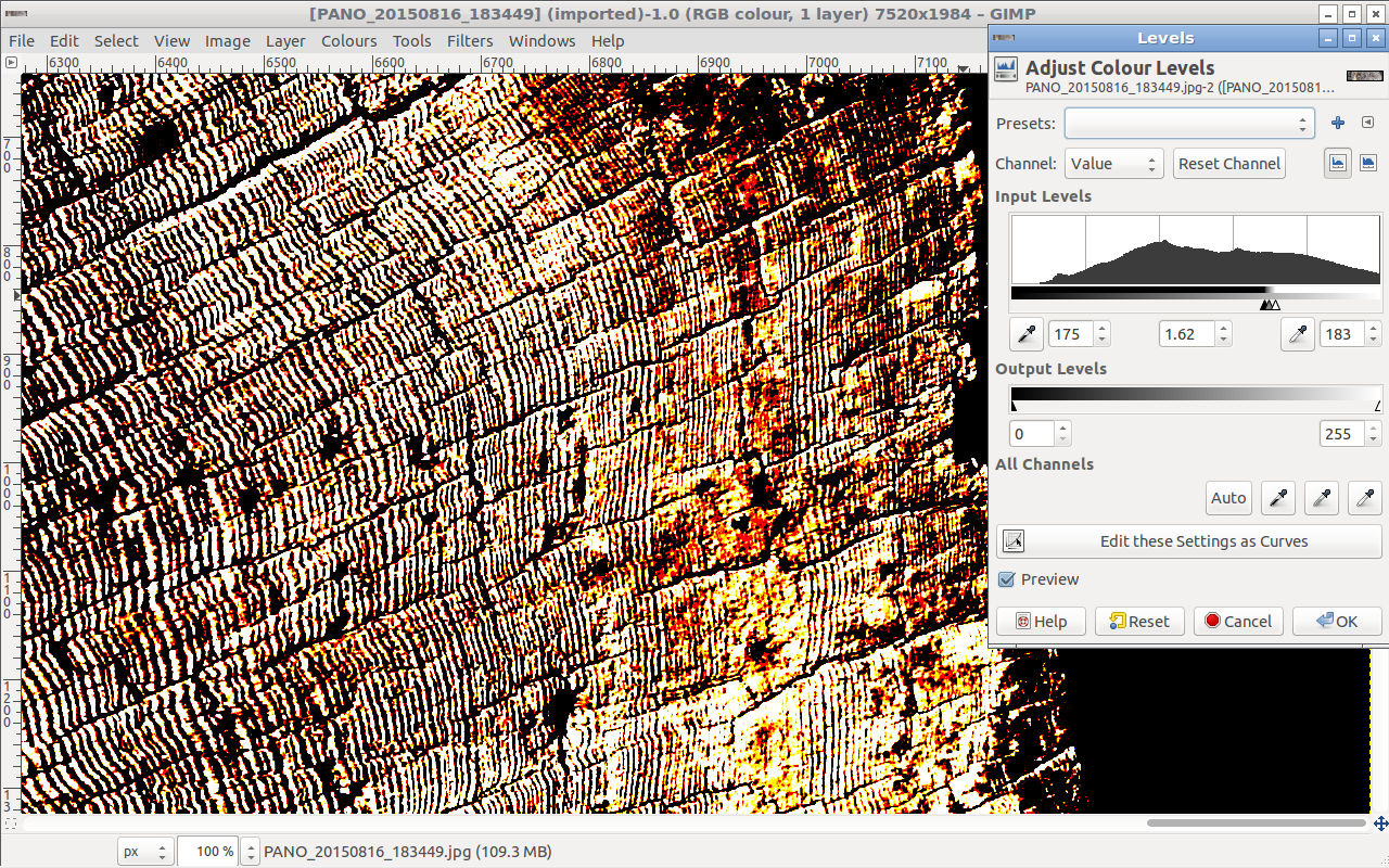
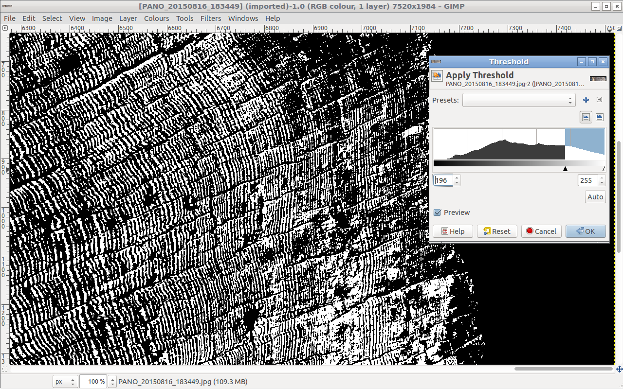
Since the illumination and relative angle of the ridges changes across the diameter of the trunk, I also tried processing it in chunks.
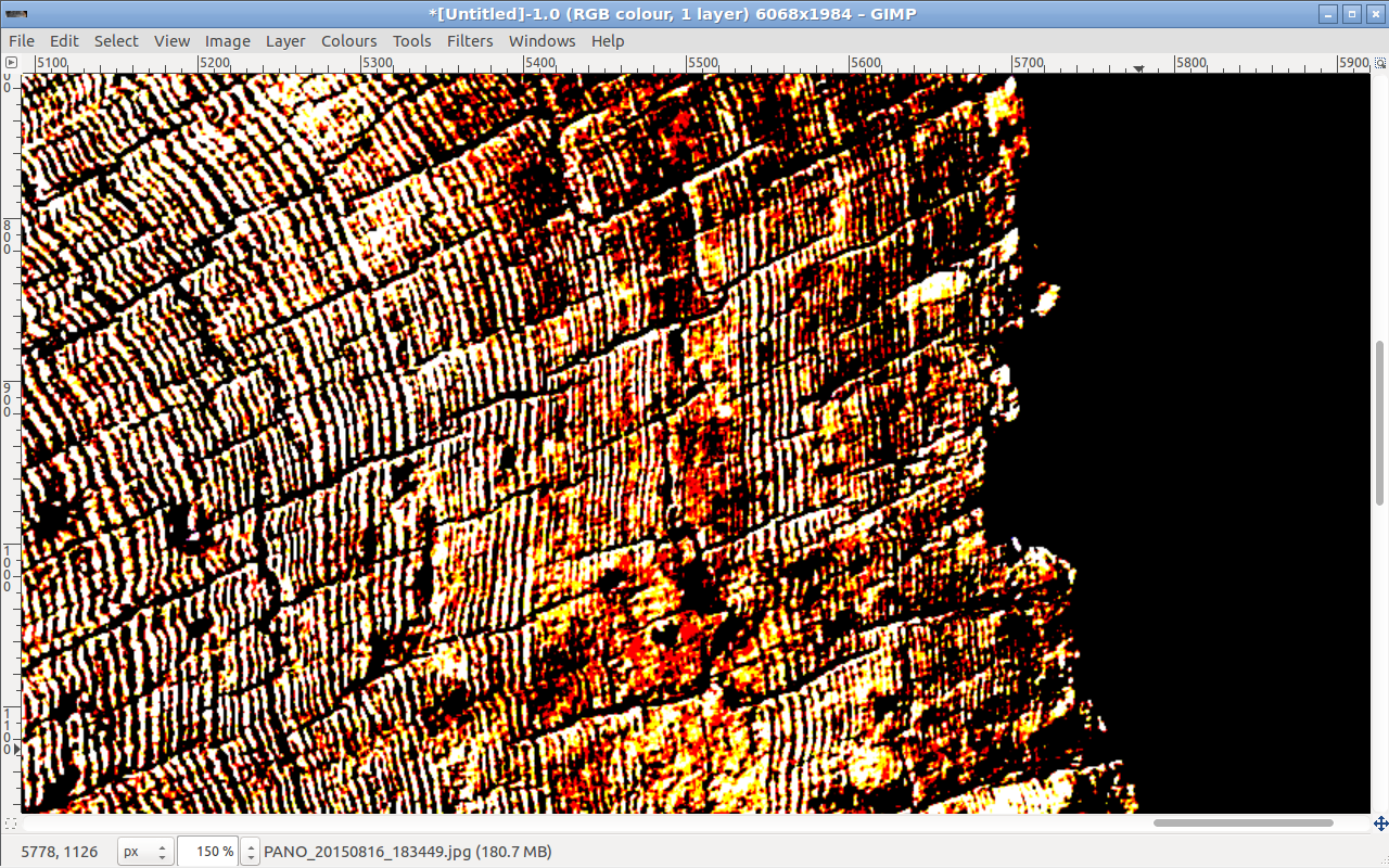
The end result is a black and white image: a binary matrix.

Here's a zoom in on part of the above image.

I can now load this into R and find the number of tree rings like so:
library(png)
img<-readPNG("bw_tree_rings.png))

#Get only one of the dimensions. It doesn't matter
#which one since this is a binary matrix so the RGB
#channels are all equal
img<-img[,,1]

#Check that a cross-section of the image is as expected
length(img[1,])

#If it wasn't, we could transpose. But it was, so we're good
#img<-t(img)

#Display the image
image(img, asp=1,axes=FALSE,useRaster=TRUE)

#Each row of the matrix is something like "0,0,0,1,1,1,0,1,1".
#Differentiating this gives "0,0,0,1,0,-1,0,1,0". Each value
#of "1" corresponds to a new ridge. Summing all the "1" values
#gives the number of tree rings. I do this for each row like so.
a<-apply(img, 1, function(x) sum(diff(x)>0))

#Print out a plot of tree rings versus image row
png('/z/tree-plot.png', width=6, height=6, units="in", res=300)
plot(a,xlab="Row", ylab="Tree Rings")
dev.off()
Which gives the following plot:
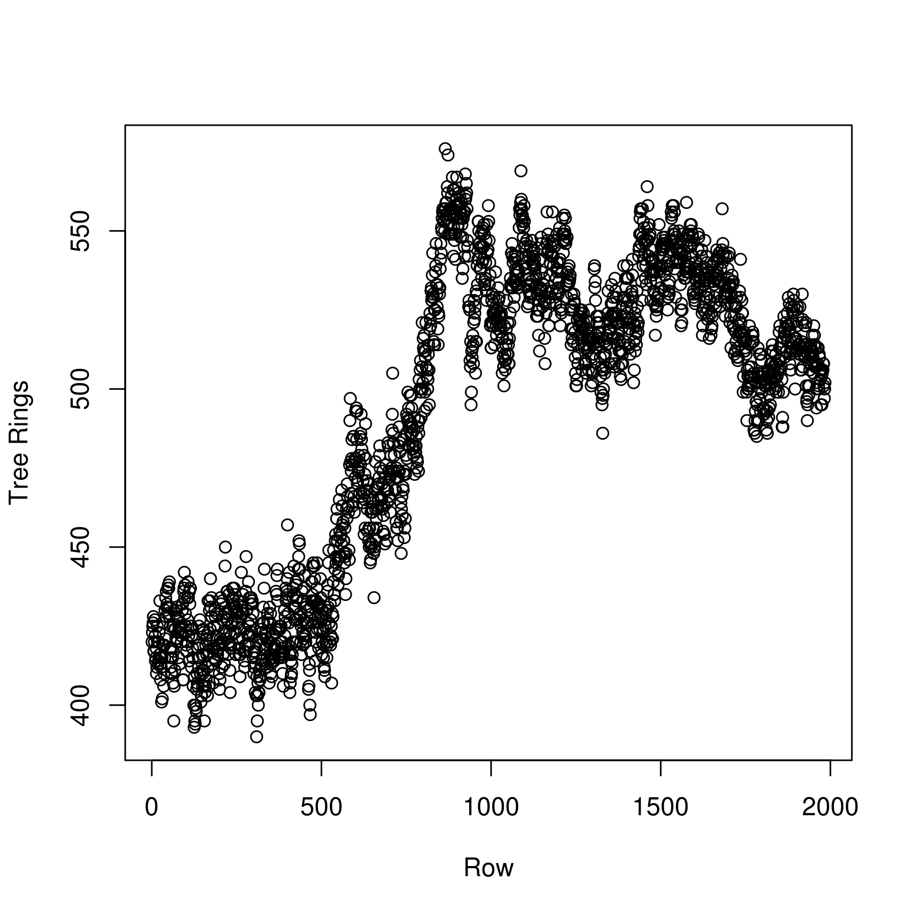
Naturally, since not every row is a diamater, most of the above plot is rubish. But, looking at the original image, we see that the center of the tree is situated just off-center (vertically) of the image. Since the image is 2000 pixels tall, we are looking for a patch of data just to one side of the mid-point; here, that corresponds to the data points around row 950 or so.
This establishes the age of the tree as approximately 550–600 years old, though the latter is true only if you believe the highest data points.
#Using the accelerometer
Since each tree ring formed a little ridge, another way to count the rings was to run AndroSensor at a high-frequency to collect my phone's accelerometer data. Holding the phone tightly in my hand to reduce damping, I ran my finger nail across a diameter of the tree. Each tree ring ridge resulted in a little bump, which the accelerometer would record.
The resulting data looks like this.
|ACCELEROMETER X (m/s²)|ACCELEROMETER Y (m/s²)|ACCELEROMETER Z (m/s²)|Time since start in ms |YYYY-MO-DD HH-MI-SS_SSS|
|-1.152|6.942|6.2474|14|2015-08-16 18:24:28:322|
|-1.152|6.942|6.2474|19|2015-08-16 18:24:28:327|
|-1.152|6.942|6.2474|36|2015-08-16 18:24:28:344|
|-1.152|6.942|6.2474|49|2015-08-16 18:24:28:357|
|-0.9712|6.9156|6.451|58|2015-08-16 18:24:28:366|
|-0.9712|6.9156|6.451|64|2015-08-16 18:24:28:372|
|-0.9712|6.9156|6.451|67|2015-08-16 18:24:28:375|
|-0.9712|6.9156|6.451|75|2015-08-16 18:24:28:383|
|-0.8442|7.1443|6.7132|78|2015-08-16 18:24:28:386|
|-0.8442|7.1443|6.7132|80|2015-08-16 18:24:28:388|
Plotting the vector norm of the acceleration, the entire data set looks like this:
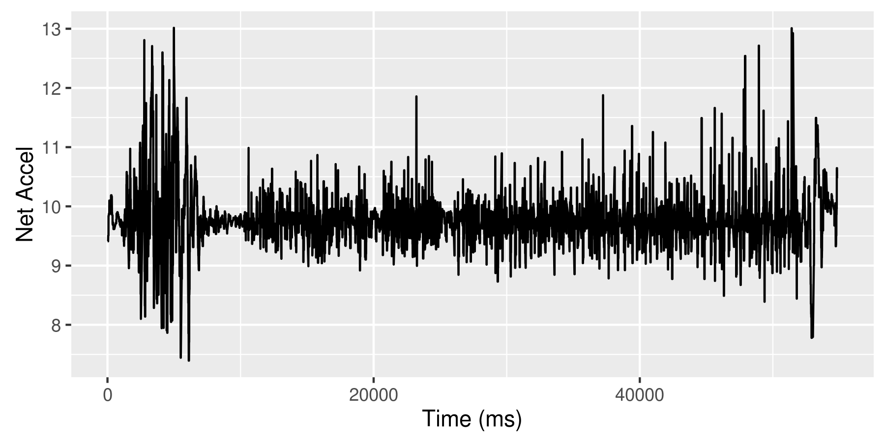
The first bit is me testing trying out the method. Then there's a quiet bit where I simply hold the phone with my finger resting on the tree. This gives me some calibration data so I can get a sense of how the accelerometer's background noise. Next, I begin running my fingernail across the tree trunk. There are occasional pauses as I relocate my body.
The calibration data looks a bit like this.
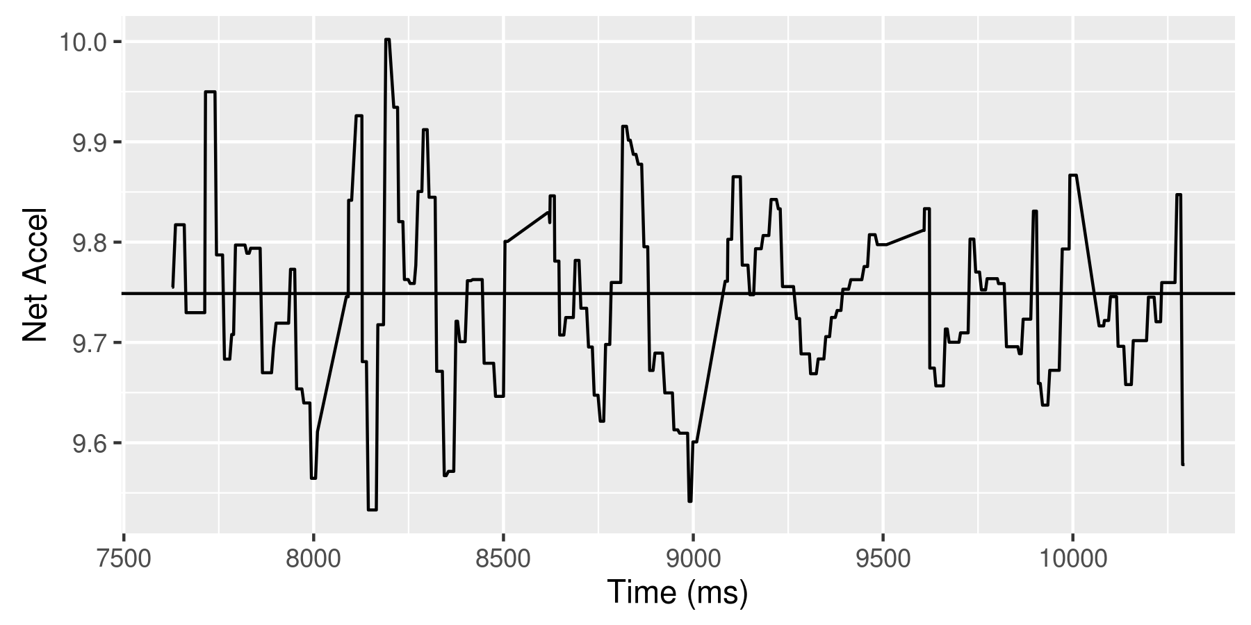
The distribution of the calibration data about its mean is
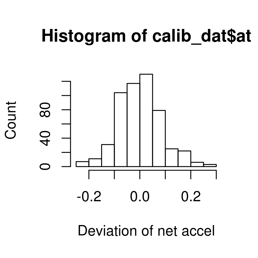
From the foregoing, it seems reasonable to classify every data point within 0.1 of the mean as being noise. Therefore, I manipulate the data by tossing out the negative side of the waveform (since every acceleration is followed by a deacceleration) and then removing all data beneath this noise threshold. I can then approximate the age by differentiating the signal and counting rises.
This gives 502 tree rings.
A hand count (I had to know!) gives 672 rings, so it seems that both of the methods I used were a bit losy.
The code for that is as follows:
library(ggplot2)

file='Sensor_record_20150816_182523_AndroSensor.csv'
dat<-read.csv(file, sep=';')
dat<-data.frame(dat)
colnames(dat)<-c('ax','ay','az','ms','date')
dat$at<-sqrt(dat$ax**2+dat$ay**2+dat$az**2)
head(dat)

#Show all the data
png('/z/tree-sound.png', width=6, height=3, units="in", res=300)
ggplot(dat)+geom_line(aes(x=ms,y=at))+ylab("Net Accel")+xlab("Time (ms)")
dev.off()

#Find the calibration period start and end times with
#plotting and some trial and error
calibration_period<-(7625<dat$ms & dat$ms<10295)
calib_dat<-dat[calibration_period,]
#plot(calib_dat$ms,calib_dat$at)

#Get the mean of the calibration data
datmean<-mean(calib_dat$at)

#Plot calibration period
png('/z/tree-calib.png', width=6, height=3, units="in", res=300)
ggplot(calib_dat)+
  geom_line(aes(x=ms,y=at))+
  xlab("Time (ms)")+
  ylab("Net Accel")+
  geom_hline(yintercept=datmean)
dev.off()

#Shift the data so it is centered about the mean
calib_dat$at<-calib_dat$at-datmean

#Plot a histogram of the shifted calibration data
png('/z/tree-hist.png', width=3,height=3,units="in",res=300)
hist(calib_dat$at, xlab="Deviation of net accel", ylab="Count", title="")
dev.off()

#Note that most of the noise falls within +/-0.1 of the mean,
#and nearly all falls within +/-0.2

#Shift all of the data and take a peek
dat_period<-(10790<dat$ms & dat$ms<51489)
dat_dat<-dat[dat_period,]
dat_dat$at<-dat_dat$at-datmean

ggplot(dat_dat,aes(x=ms,y=at))+geom_line()+ylim(-1,1)#+xlim(25000,30000)

#Keep only the positive side of the waveform
dat_dat[dat_dat$at<0,]$at<-0

ggplot(dat_dat,aes(x=ms,y=at))+geom_line()+ylim(-1,1)+xlim(25000,30000)

#Remove the noise
dat_dat[dat_dat$at<0.1,]$at<-0

ggplot(dat_dat,aes(x=ms,y=at))+geom_line()+ylim(-1,1)+xlim(20000,30000)

#Count all the rises. This is an approximation of the age.
sum(diff(dat_dat$at)>0)